Collection of confusing user interfaces
When you use the web in you daily work and life, you get to encounter websites that have challenging UI that makes it hard to navigate or plain simply hard to find the information you need.
I thought it would be interesting to write a blog post to show a few examples of UI that I've always found confusing.
So let's get into it. As I find more example, I'll update this post.
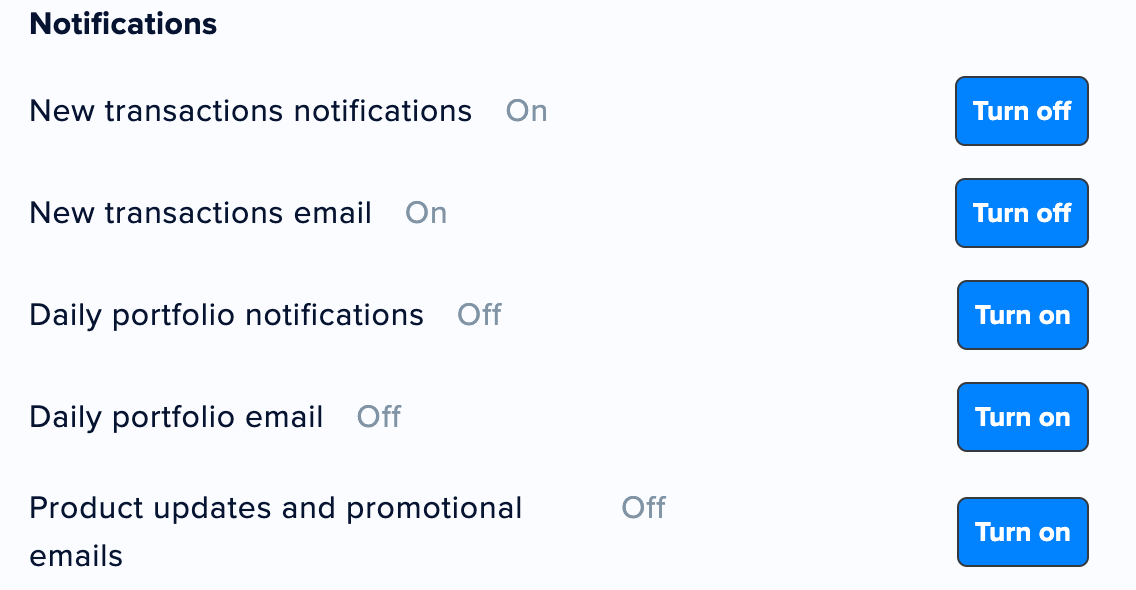
- This one screams toggles to me. For features that are binary on / off, it's often simpler to use a toggle button instead of a button. Buttons are for actions, toggles are for on/off. Using a toggle, I can quickly scan and check which feature is enabled/disabled. With buttons it's much hard to figure out that "Turn on" means it's off and that "Turn off" means it's on. There is a label next to the feature that indicates if it's on or off but if the site was using a toggle, it would not need this as the toggle state would show that information.

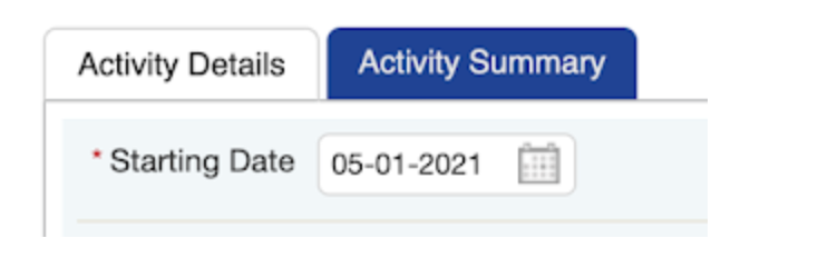
- This one might be more suble but which tab do you think is currently selected ? Every time I use this form I get confused about the tab that is currently selected. I end up clicking on "Activity Details" (light colored one) but that one is already selected. The one not selected is the one in dark blue. I wanted to show this example to explain that colors and nuances in shades can greatly affect user experience. In this case, should be light as selected or dark as selected? In my opinion, in this particular case, it should be the opposite, or at least the color differences between the light and dark should be changed. What do you think?

